Why Your Small-Business Website Gets Traffic but No Enquiries
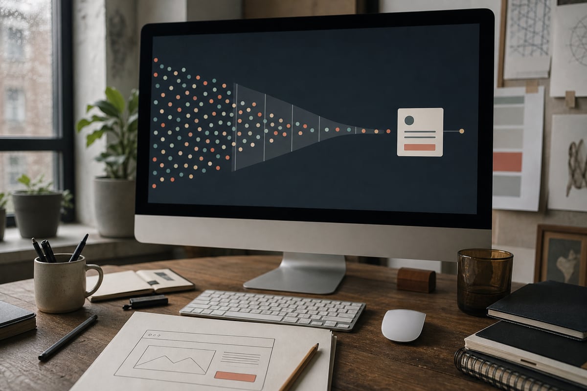
Traffic with no enquiries feels worse than no traffic.
At least an empty analytics report gives you one problem. A busy report and a quiet inbox creates ten theories: the design is wrong, the price is too high, people are only browsing, the form is broken, or the leads are somehow going to a competitor with a worse logo.
Do not redesign the whole site yet.
An enquiry path has a sequence: the right person arrives, recognizes their problem, understands the offer, believes the business can deliver, and feels comfortable taking the next step. One weak link can make every page before it look pointless.
Here is how to find the weak link without mistaking decoration for diagnosis.
First, make sure the traffic is relevant
A thousand visits from people who will never buy are not a sales opportunity.
Open the pages that receive the visits. Look at the search terms, referral sources, location, device, and landing page where your analytics allows it. Then ask what those visitors were trying to do.
A local accountant may attract nationwide traffic to a tax-definition article. A furniture maker may get image-search visits from students collecting references. A software studio may rank for a technical error message while its actual buyers never see the service page.
The traffic is real. The commercial intent is not.
Group visits into three rough buckets:
- Buyers: people looking for the service, product, price, or provider.
- Researchers: people learning about the subject, possibly for a future purchase.
- Accidental visitors: people whose query happens to overlap with your words.
Judge the enquiry path mainly on buyer traffic. Keep useful research content, but give it a clear bridge into a related service. Do not demand that every blog reader become a lead.
Your offer may be too vague to recognize
"We create innovative solutions for growing businesses" can describe a software studio, consultant, marketing firm, printer, or office furniture supplier.
A visitor should be able to answer three questions near the top of a service page:
- What do you do?
- Is it for a business like mine?
- What becomes easier or better after I buy it?
Specific language feels less grand and sells better. "Booking websites for independent clinics" gives a buyer somewhere to stand. "Digital experiences that transform possibility" gives them homework.
This does not mean cramming every detail into the hero. It means naming the customer and job before discussing your philosophy.
Read the page aloud and circle every sentence a competitor could copy without changing a word. Those sentences are probably using space without reducing uncertainty.
The next step asks for too much
Many websites offer two choices: leave, or "Get a Quote."
That is a large request when the visitor still does not know the process, likely price, timing, or whether the business handles their kind of project. The button is visible. The decision behind it is not ready.
Make the next step match the visitor's stage.
Someone comparing options may want to see prices, examples, availability, or a short explanation of the process. Someone with a defined project may be ready for a consultation. Someone checking whether you serve their area only needs a direct answer.
Useful next steps include:
- see packages or planning ranges
- check availability
- view a relevant case study
- choose the right service
- estimate a project
- ask one question
You can still lead to one primary enquiry. The supporting steps help a cautious buyer reach it.
Our argument that a website should be a decision tool, not a brochure is about exactly this gap. A site should help someone make progress, not merely admire the company.
Trust arrives too late
A testimonial carousel in the footer cannot repair six screens of unsupported claims.
Put evidence beside the promise it supports. If you say the process is quick, show the usual timeline. If you say you understand restaurants, show restaurant work. If you promise attentive support, explain who answers and what happens after launch.
Strong trust signals are often ordinary:
- a real name, location, and way to contact the business
- recent work explained with enough context to judge it
- reviews that mention a concrete result or experience
- clear pricing guidance or an honest reason a quote varies
- a process with visible steps
- policies written for a customer, not hidden until checkout
Generic five-star graphics are weak evidence. So are logos without a sentence about what you did. A modest case study with a specific problem and decision carries more weight.
Check placement too. If the visitor is deciding whether you understand their industry, put the relevant example on that service page. Do not make them hunt through a portfolio and infer the connection.
The page may be fighting the phone
Your own phone on office Wi-Fi is not a mobile test.
Try the enquiry path with one hand. Use a slower connection. Increase the text size. Dismiss the cookie notice. Open the menu, compare two services, tap the phone number, and complete the form with the keyboard covering half the screen.
Look for:
- a call-to-action hidden after a tall visual
- text too small to scan comfortably
- sticky elements covering controls
- a menu that loses the visitor's place
- phone numbers that are not tappable
- fields with the wrong mobile keyboard
- layout shifts that move a button during a tap
- images that delay the useful content
Google's current Core Web Vitals guidance focuses on loading, interactivity, and visual stability, all measured from a user's experience. PageSpeed Insights can reveal technical friction, but complete the real journey too. A fast score does not prove the form makes sense.
For the commercial case, see how website speed costs sales. Speed is not the whole conversion problem, but it can prevent a good page from getting a fair chance.
The form is designed for your database
An enquiry form often asks for everything the business might eventually want: company size, budget, phone, address, industry, launch date, referral source, project type, and a detailed message.
The visitor has not agreed to a project. They are trying to find out whether a conversation is worthwhile.
Ask only what changes the first response. Name, contact detail, and a plain description may be enough. A budget range can help if it prevents a serious mismatch, especially when you explain why you ask. A twelve-field qualification form may be appropriate for high-volume applications, but it should earn every field.
Then test delivery.
Submit the form from outside the business. Check the success state, confirmation email, spam folder, internal notification, and reply path. Repeat on a phone. Forms fail quietly after plugin updates, email-provider changes, expired integrations, and innocent edits.
The success message matters as well. Tell the person what happens next and when. "Submitted successfully" confirms a database event. "We will reply within one working day from hello@example.com" reduces doubt.
One page cannot serve every reason to buy
Sending all paid and search traffic to the homepage forces each visitor to sort out the relevance.
A person searching for emergency plumbing, monthly bookkeeping, wedding photography, or a custom booking system has a specific question. Give each meaningful service its own page with the details, proof, and next step that fit that decision.
This is not permission to generate a hundred thin pages by swapping a town name. Build pages where the offer, evidence, process, or questions genuinely differ.
Match the promise too. If an advertisement says "fixed-price website maintenance," the landing page should explain that service. Do not drop the visitor at the top of a general homepage and expect them to search for the phrase they just clicked.
Measure the path, not just the total
Set up a small funnel:
- relevant landing-page visit
- service or pricing detail viewed
- primary call-to-action clicked
- form started
- form submitted
- qualified enquiry confirmed
The drop tells you where to work.
Few service-page views suggest the landing page or navigation is unclear. Plenty of call-to-action clicks with no form starts suggests a technical or expectation problem. Form starts without submissions points to friction. Submissions that never become qualified conversations point back to targeting and offer.
Do not obsess over a universal conversion-rate benchmark. A $40 purchase, a restaurant reservation, and a $30,000 project should not convert at the same rate. Compare the same path over time and review the actual quality of enquiries.
A focused seven-day repair
If the site is getting relevant traffic, spend one week on the path before commissioning a redesign.
Day 1: choose the one service and audience that matter most.
Day 2: rewrite the first screen to name the service, customer, and outcome.
Day 3: add one relevant example, one concrete review, and honest process or price guidance.
Day 4: make the primary next step clear and add one lower-commitment route for visitors who need more information.
Day 5: shorten and test the form from two phones and an external email address.
Day 6: inspect performance, mobile layout, and analytics events.
Day 7: watch the path, read the enquiries, and write down the next largest point of uncertainty.
That week will not solve a bad market or an offer nobody wants. It will tell you much more than changing the font and hoping.
If your site has traffic but the enquiry path is leaking, show us the path. We can audit the evidence, friction, and measurement before recommending what deserves a rebuild.
Ready when you are.
Fix your enquiry pathGet the next one in your inbox
Occasional, practical notes on building sites that sell. No spam, unsubscribe anytime.
Keep reading

Your Website Is a Decision Tool, Not a Brochure
A useful business website does more than describe the company. It helps a real person make the next decision with less doubt, less hunting, and fewer open tabs.

When to Hire a Web Designer vs Do It Yourself
An honest breakdown of DIY versus hiring for a small business site, plus the middle path I actually recommend to most people who ask me.