Your Website Is a Decision Tool, Not a Brochure

A brochure can get away with being admired. A website has work to do.
Someone opens it with a question already moving around in their head. Can these people solve my problem? Is this the right option for a business my size? What will it cost? Can I trust them with the awkward part? If the site answers none of those questions, a handsome homepage is just a well-lit waiting room.
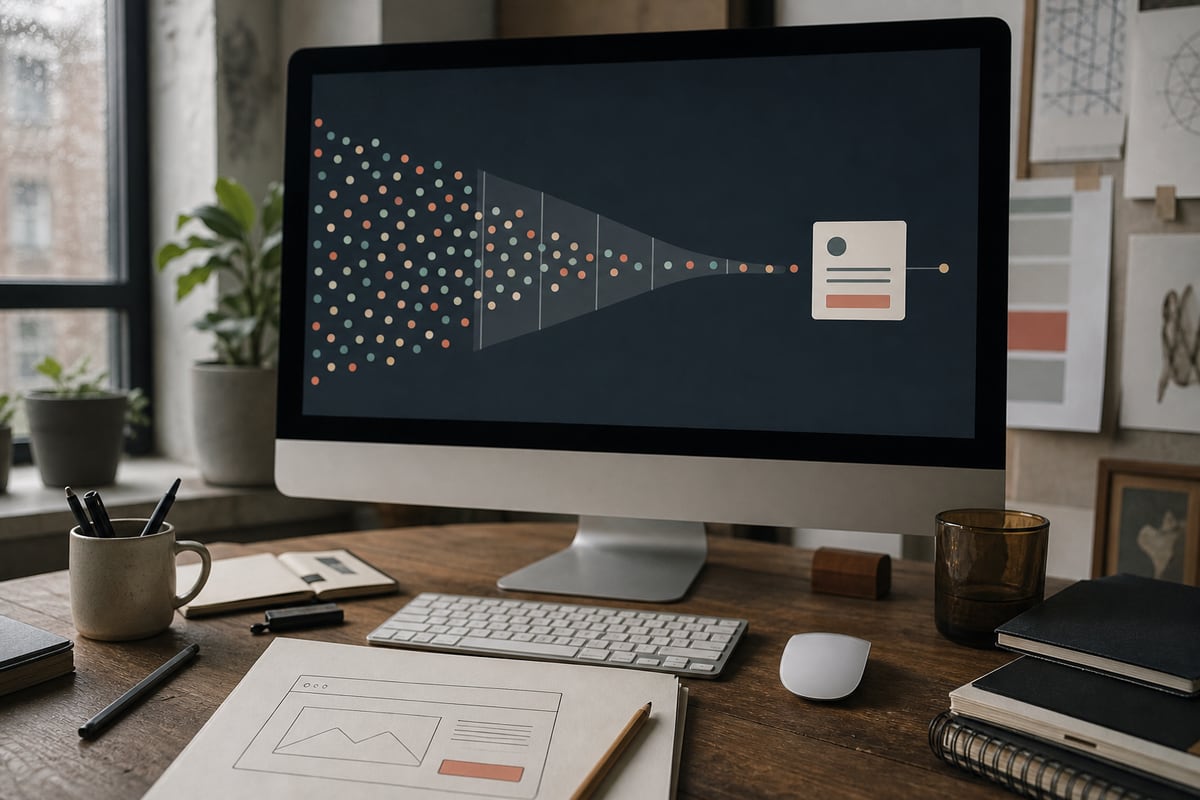
This is why a website should be designed as a decision tool. Its job is not to say everything about the company. Its job is to help the right visitor reach a sensible next step without making them assemble the story themselves.
Start with the decision, not the page list
Most website plans begin with familiar nouns: Home, About, Services, Contact. That is tidy, but it says nothing about what a visitor needs to decide.
Start with one sentence instead: After visiting this site, the right customer should be able to decide whether to take the next step with us. Then write down what they need before that decision feels safe.
A restaurant guest may need the menu, location, opening hours, dietary information, and a reliable way to reserve. A software buyer may need to recognize their problem, understand the approach, see evidence, judge the likely effort, and know what happens after an enquiry. A hotel guest needs room differences, total price, policies, and location context. The pages can come later.
This shift sounds small. It changes what earns space. The team biography matters when trust in the people affects the purchase. A long company history matters only when it helps someone judge continuity, expertise, or values. A services page matters when it helps a visitor recognize which path fits them. Content stops being a collection of things the business wants to say and becomes a sequence of questions the customer needs answered.
Every click spends confidence
Visitors do not arrive with unlimited patience. They arrive between meetings, on a phone, with another option one tab away.
Each vague label or hidden fact asks them to spend a little confidence. "Solutions" makes them guess what is inside. "Get started" hides whether the next step is a call, a payment, or a twelve-field form. A portfolio with beautiful images but no explanation asks them to infer what the team actually contributed.
None of these mistakes is dramatic. That is why they survive redesigns. Together they create a low hum of uncertainty, and uncertainty often looks like a visitor quietly leaving.
Clear websites preserve confidence by being specific:
- Say who the service is for and which problem it handles.
- Show a real process, including what the customer must provide.
- Put price ranges or the factors that shape price where people can find them.
- Explain what happens after the primary button is pressed.
- Use evidence close to the claim it supports.
- Make practical details easy to scan on a phone.
Specificity is not the enemy of good design. It is the material good design organizes.
Give each page one useful job
A homepage often collapses under committee pressure. Everyone wants their paragraph near the top, so it becomes a parade of slogans, logos, features, values, testimonials, posts, awards, and a form asking for six details before the visitor knows whether they are interested.
Give the homepage a narrower job: help the right person recognize themselves, understand the offer, and choose where to go next.
A service page can then help them compare fit. A case study can reduce doubt with a concrete before and after. An About page can answer why this particular team is credible. A pricing guide can help someone decide whether the scale is realistic. The contact page can set expectations for the first conversation.
When a page owns a job, editing gets easier. A section either helps with that job or it does not. The decision is less political because the criterion is visible.
This is also how a smaller website can outperform a larger one. Five focused pages often do more commercial work than forty thin pages written because a competitor had them.
Design the moment after "yes"
Many sites put enormous care into persuasion and almost none into the moment a visitor agrees.
The button says "Let's talk." The next screen asks for company size, budget, timeline, phone number, project summary, referral source, and possibly the name of a childhood pet. After submission, the visitor gets "Thanks!" and no idea when anyone will reply.
The conversion is not finished when the form is sent. It is finished when the person knows what they committed to and what happens next.
A good enquiry flow might say that the form takes two minutes, which fields are optional, when the team usually responds, and whether the first call is exploratory or a paid consultation. A booking flow should show duration, timezone, rescheduling rules, and what to prepare. An ecommerce confirmation should answer delivery and support questions before they become emails.
These details feel operational because they are. Good web design often begins where marketing ends and the actual business process starts.
Watch one person use it
Analytics can show that people leave a page. Watching one person can show why.
Ask someone close to the intended customer, but not close to the project, to complete a realistic task. "Find out whether this company can redesign a booking system and what you would do next" is better than "What do you think of the website?"
Do not guide them. Notice the words they search for, the sections they skip, the point where they open the navigation, and what they expect a button to do. Ask them to say what they believe after each page. Their misunderstanding is more useful than a compliment about the colors.
Three short sessions will not produce a scientific verdict. They will expose obvious assumptions the project team can no longer see. If all three people hesitate at the same moment, believe the hesitation.
The best website may create fewer enquiries
That sounds like a strange goal until you count the wrong enquiries.
A vague site can produce a busy inbox full of people who cannot afford the service, need something the team does not offer, or expected a product when the business sells consulting. A clearer site may reduce the raw number while improving the conversations that remain.
Conversion should mean movement into the right next state, not maximum button presses. Sometimes the useful outcome is a booking. Sometimes it is reading a detailed guide, choosing a template, calling the nearest location, or realizing the service is not a fit. Saving both sides a pointless sales call is a successful decision too.
If your current site feels polished but strangely quiet, do not begin by changing the color of the main button. Write down the decision each important visitor is trying to make. Then read the site as if you have their limited context, their reasonable doubts, and four other tabs open.
The missing piece is rarely another slogan. It is usually the honest answer that makes the next step feel safe.
If you are choosing a starting point, our guide to template versus custom builds will help. If the site already exists, bring us the confusing journey. We will start with the decision before we start drawing the page.
Ready when you are.
Plan a clearer websiteGet the next one in your inbox
Occasional, practical notes on building sites that sell. No spam, unsubscribe anytime.
Keep reading
Why Your Small-Business Website Gets Traffic but No Enquiries
A practical diagnosis for the frustrating middle: people visit the site, but the phone stays quiet and the enquiry form gathers dust.

When to Hire a Web Designer vs Do It Yourself
An honest breakdown of DIY versus hiring for a small business site, plus the middle path I actually recommend to most people who ask me.