Best Hotel Website Templates in 2026: What Actually Matters
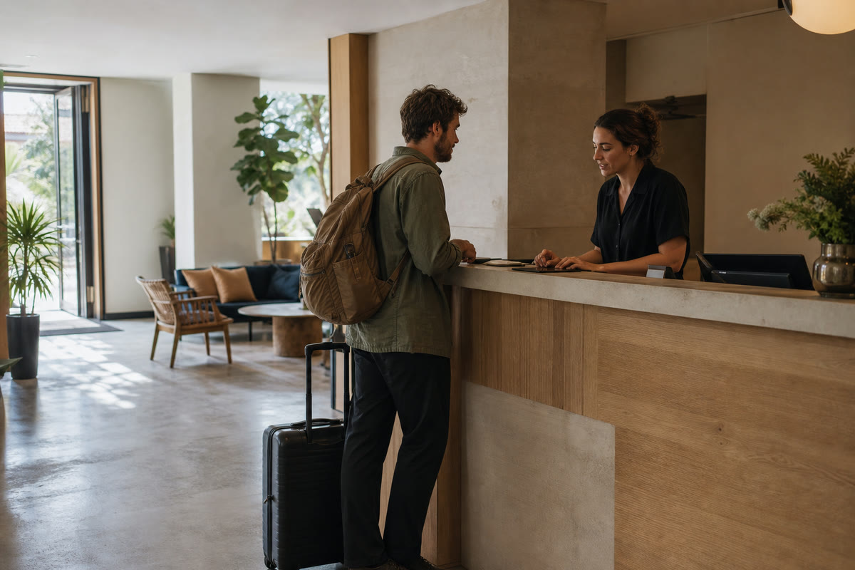
Hotel templates are very good at selling you the demo hotel. The infinity pool catches the light, the room has apparently never been slept in, and a thin serif logo floats over the sea. Five minutes later you still cannot tell whether the template handles room rates properly.
That is the trap.
A hotel website is not a photo gallery with a booking button attached. It is a short decision system for a traveler who has six tabs open. They are comparing the room, the total price, the location, the cancellation terms, and a faint but important question: does this place seem as real as the listing says it is?
The best template is the one that answers those questions with the least fuss. It may also be beautiful. Beauty just does not get to skip the practical exam.
Give every template the five-minute test
Open the demo on your phone and pretend you need a room for two people next month. Do not admire the homepage. Try to complete the job.
Can you find the rooms? Can you tell how one room differs from another? Is the rate clear, including whether breakfast or taxes are included? Can you reach availability without closing a popup? Do you know where the property is in relation to the reason for your trip?
If any answer takes more than a minute, the template has already handed an advantage to the booking platform in the next tab.
The strongest hotel templates make four things boringly easy:
- Compare rooms. Each room needs its own page or substantial section with capacity, bed setup, size, amenities, accessibility notes, a useful photo set, and a clear route to availability.
- Check dates and book. The booking button should be visible, specific, and consistent. "Check availability" is usually clearer than "Discover" or "Begin your journey," especially at 11:40pm on airport wifi.
- Understand the place. A real address, map, travel times to useful landmarks, check-in hours, parking or transfer details, and a phone number that can be tapped.
- Trust the terms. Cancellation rules, payment timing, taxes, deposits, child policies, and what happens after the booking. Put the awkward details where people can see them.
The booking flow is the product
Many hotel templates treat the booking widget as a rectangle to decorate. It is the main commercial feature of the site.
Before buying a template, find out what sits behind that rectangle. Is it a real integration point for your property management or booking system? Does it pass the selected dates through, or make the guest choose them again? Does it open a third-party page that still resembles your property, or dump them into a generic portal with a different logo and twelve new fields?
A small guesthouse taking enquiries may be fine with a short request form. A twenty-room hotel needs live availability. A group with multiple properties needs guests to understand which location they are booking before they pay. Those are three different flows, even if the demos all use the same tasteful photograph of a robe.
Test the unhappy paths too. Pick dates with no rooms. Enter a party larger than the room capacity. Back out after choosing a rate. A template demo will not always connect to real inventory, but its screens should show that someone thought about these moments.
Google can also send travelers from free hotel booking links to the property's own website to complete a reservation. Its Hotel Center guidance makes the destination important: if the official site receives that click, the booking path has to earn it. A slow page or a surprise rate is an expensive way to send the guest back to an online travel agency.
Pick for the property you actually run
"Hospitality" is a wide shelf. A useful template for a mountain guesthouse can be a bad fit for a city hotel, even when both demos look expensive.
Boutique hotel. Editorial photography and a strong story can matter here because the character of the place is part of the purchase. Look for flexible room pages, local guides, and enough layout variety that every page does not repeat the same full-width photograph. Keep booking persistent while the story unfolds.
Guesthouse, homestay, or bed and breakfast. Warmth beats grandeur. A simple owner introduction, honest room photos, breakfast details, arrival instructions, and direct contact can carry the site. Avoid templates with dozens of resort sections you will fill with vague copy. Empty ambition looks stranger than a small site that knows what it is.
Resort or experience-led stay. You need activities, dining, spa or wellness, packages, and possibly several booking paths. The navigation has to keep those offers organized without hiding rooms. Check whether the template supports useful cross-links such as a room connected to a package, not just separate pages floating in the menu.
Tour operator or short-stay collection. Search and comparison matter more. Dates, group size, location, duration, and inclusions need structured layouts. A single-property hotel theme stretched across twenty tours becomes a long stack of cards and hope.
Our hospitality and travel collection covers these shapes, so filter by the business before you filter by color. Starting with the right bones saves more money than clever customization later.
Photography is content, not wallpaper
A hotel can survive ordinary typography. It cannot survive misleading photos.
Choose a template that makes room for the images guests use to decide: the view from the actual room, the bathroom, the bed layout, the entrance, the breakfast space, and the less glamorous but useful facts such as parking. Wide atmospheric shots belong on the homepage. Room pages need evidence.
Watch how the template crops images on a phone. A beautiful wide room shot can become half a lamp and somebody's elbow inside a tall mobile card. Check whether focal points can be adjusted and whether galleries support captions. Captions are where you can say "Room 4, second floor, stair access only" instead of leaving a guest to guess.
Use your own photos before launch. A template filled with borrowed demo images is not eighty percent finished; it is a very convincing empty shell. If the photography budget is tight, one careful half-day shoot will usually do more for direct bookings than another week of homepage animation.
What we would skip
The hotel category attracts a particular kind of decorative excess. You can leave most of it on the showroom floor.
Skip the full-screen welcome animation. A returning guest checking the address does not need to watch the logo assemble again. Skip autoplay music; the lobby playlist does not improve when it ambushes someone on a train. Be suspicious of horizontal scrolling galleries, pale text over busy skies, and navigation labels that replace "Rooms" with something poetic.
Also skip templates that hide every practical answer in a frequently asked questions accordion. Policies deserve a proper page, and the booking flow should repeat the terms that affect payment. Making information technically present is not the same as making it findable.
Finally, do not mistake a huge feature list for flexibility. You need the features your operation can keep current. An abandoned events calendar or a blog last updated three summers ago makes the property feel unattended. A focused site with accurate rooms, rates, photos, and local information is the stronger signal.
Template or custom build?
A template is the sensible starting point for most independent properties when the booking system already exists and the website's job is to present it well. Choose a base that matches your kind of property, run the five-minute test, and then read what to check before buying a template. Our guide to avoiding the generic template effect will help once your own photos and voice go in.
Custom work starts earning its cost when the site has to search several properties, combine rooms with packages, support unusual rate rules, serve several languages with different inventory, or connect systems that do not already cooperate. It also earns its cost when direct booking is a large enough channel that a small conversion improvement pays for the build.
Whichever route you take, test the finished site on a middling phone and a bad connection. Travelers rarely research from the same desk and broadband used to approve the design. Site speed costs real sales, and a hotel guest with other options is not famous for patience.
Browse the hospitality templates with your own room list and booking flow beside you. If your property does not fit the usual boxes, tell us how it works. We would rather recommend a smaller honest setup than sell you a grand lobby with no front desk.
Ready when you are.
Browse hospitality templatesGet the next one in your inbox
Occasional, practical notes on building sites that sell. No spam, unsubscribe anytime.
Keep reading
Best Gym and Fitness Studio Website Templates in 2026
What a gym site actually has to do (schedule, trial offer, proof), the template features that matter, and the ones we would pick for studios, PTs, and gyms.
The Best Website Templates for a Restaurant in 2026
A curated guide to what actually makes a restaurant website template worth buying in 2026, and how to match one to your cafe, bistro, or takeaway.