Prototype the Awkward Screen First
The first screen in a product prototype is usually the dashboard. It has a tidy sidebar, four confident numbers, a recent activity list, and just enough chart to make the meeting feel productive.
It is also usually the screen the team understands best.
The difficult screen is hiding somewhere less photogenic. It is the spreadsheet import with three bad rows. The appointment that needs to move after payment. The account owner removing the only other administrator. The customer cancelling while they still have a credit balance. That is where the product's rules stop being a slide deck and start disagreeing with one another.
We try to prototype that screen first.
Not because starting ugly is morally superior. It is simply cheaper to discover a policy argument with paper rectangles than after the database, API, and polished dashboard all assume the wrong answer.
What counts as the awkward screen
It is not always visually complicated. Often it looks like a plain form. The awkwardness lives underneath.
A good candidate has one or more of these traits:
- Several people have different permissions or incentives.
- The action is hard to reverse: payment, deletion, publishing, approval, cancellation.
- Real-world mess enters the system through it: imported data, handwritten records, missing documents, duplicate customers.
- An outside service controls part of the result: a payment gateway, calendar, courier, identity check, or government system.
- The person using it may be stressed, embarrassed, or in a hurry.
- The happy path is obvious but the third and fourth outcomes are not.
Take a booking product. Picking a free time is easy to draw. Now try rescheduling a paid appointment when the new slot costs more, the staff member has changed, and the original discount has expired. Does the customer pay the difference? Does the business honor the old price? Can staff override it? Who gets notified? What happens if the payment succeeds and the calendar update fails?
That one awkward flow contains pricing, permissions, audit history, notifications, and failure recovery. A polished calendar screen can hide all five for months.

Start with paper when the argument is about rules
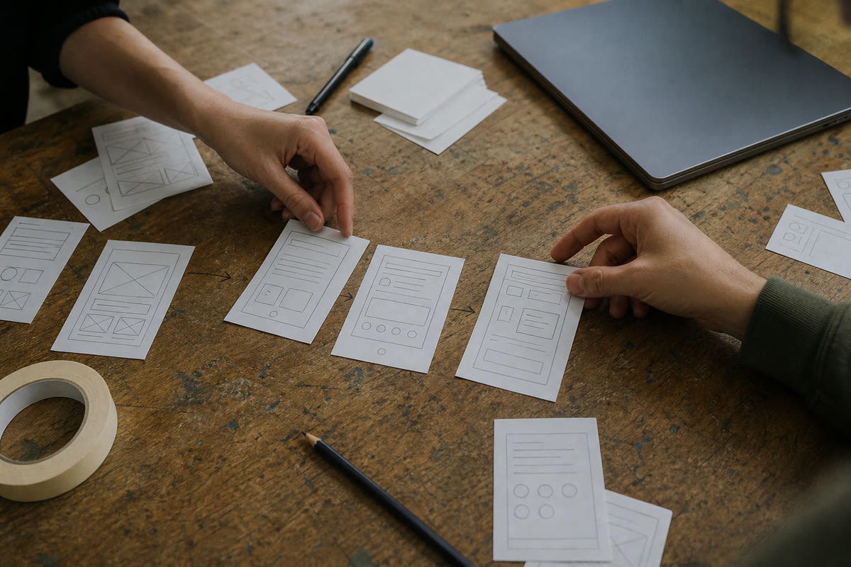
Paper prototypes have an unfair reputation for being a workshop exercise involving expensive markers. Their real strength is that nobody mistakes them for finished software.
Draw the screens badly. Use index cards for modals. Put a sticky note over the button when a permission removes it. Hand the stack to someone who was not in the design conversation and ask them to complete the task. When they tap the paper, swap in the next sheet.
The roughness gives people permission to object. Put a polished high-fidelity mockup on a screen and the feedback turns into font sizes and corner radius, even when the flow is nonsense. Put down a crooked paper form and somebody says, "We cannot ask for that until the customer has a case number." That sentence may save a sprint.
Code is useful when the unknown is technical rather than procedural. If the risk is whether a camera scanner can read a damaged label, whether a map stays responsive with ten thousand points, or whether the payment provider supports the split you promised, build the smallest real spike that answers that question. No design system, no reusable abstraction, no heroic architecture. It is allowed to be thrown away.
This is one place coding agents genuinely help. They make a disposable technical prototype cheap enough that we can test three ideas instead of defending the first one. The catch from how coding agents changed our work still applies: fast code does not decide which risk matters.
The awkward screen writes the data model
Teams often design the database from the nouns in the brief. User. Booking. Product. Invoice. Then an edge case arrives and reveals that the nouns have states, histories, and relationships the first diagram ignored.
The cancellation screen asks whether an order can be partly refunded. That question creates line-level payment records. The approval screen asks who changed a decision and why. That creates an audit trail. The import preview asks whether two rows refer to the same customer. That creates matching rules and a way for a person to resolve uncertainty.
This is why early awkward-flow work is not just UX. It finds architecture while the architecture is still cheap to change.
It also exposes vocabulary. A clinic may use "client" at reception and "patient" in care notes. A construction team may call the same thing a job, site, project, or contract depending on who is speaking. Those differences feel editorial on a dashboard. Inside a handoff or approval flow, they create real mistakes. Watching people stumble over labels in a prototype is useful data.
A small method that works
We use a short sequence. It is not precious enough to need a branded diagram.
Write the scary sentence. "A customer paid, but the supplier cannot fulfill one item." "The only administrator left the company." "Half the imported rows have no email address." If the sentence contains a polite version of "then what?", you found the right place.
List outcomes before screens. Success, partial success, failure, timeout, duplicate action, cancellation, and retry. Not every flow needs all seven. Writing them down prevents the design from quietly assuming success is the only state.
Assign authority. Who may decide, who must be told, and who can undo it? Products get strange when a button exists but nobody agrees who is allowed to press it.
Make the cheapest truthful prototype. Paper for rules and sequence, a clickable mockup for comprehension, working code for technical uncertainty. The fidelity should match the question.
Test with three people close to the work. Not thirty survey respondents. The receptionist who handles exceptions, the manager who approves money, and the new employee who does not know the unwritten shortcuts will expose plenty.
Write down what changed. A prototype without a decision log becomes a vivid afternoon everyone remembers differently.
Then throw away whatever deserves throwing away. Keeping prototype code because it exists is how a two-hour experiment becomes a five-year dependency. Boring technology is valuable in production; prototypes are allowed to be temporary and rude.
Do not turn edge cases into the whole product
There is a failure mode on the other side. Once a team starts hunting exceptions, it can design the entire product around the rarest disaster. The result is a basic task buried under warnings, confirmations, and settings for scenarios that happen twice a year.
Prototype the awkward case early so the system can support it. Do not force every user to walk through it.
The common path should stay short. Exceptional controls can appear when the state requires them. Staff overrides can live behind the right permission. Recovery tools can be plain and internal. Good software respects edge cases without making the happy path wear all their luggage.
There are also products where the risk is already well understood. A simple marketing site, a standard catalog, a basic contact form: we do not need to reenact product discovery for solved shapes. That is when a good template or a familiar pattern is the responsible shortcut. Innovation theatre is still theatre, even with sticky notes.
The prettier screens come later
Once the difficult flow holds together, the dashboard gets easier. You know which states deserve counts, which alerts matter, what the words mean, and which actions belong near each other. The attractive overview becomes a summary of a product that exists, not a stage set for one everyone hopes to build.
That order also makes estimates more honest. We have touched the risky integration, argued through the policy, and seen the messy data before promising the calendar. Uncertainty has somewhere to go besides the contingency line.
If you are planning a product, bring the least impressive screen to the first conversation. Bring the manual workaround, the exception spreadsheet, or the email your team forwards with "what do we do with this?" at the top. That is usually the beginning of the useful work.
Bring us the hard part. We can draw the dashboard after it survives.
Ready when you are.
Bring us the hard partGet the next one in your inbox
Occasional, practical notes on building sites that sell. No spam, unsubscribe anytime.
Keep reading

The Hidden Cost of Manual Handoffs in a Small Team
The expensive part of a manual process is often not the task itself. It is the gap between two people, two tools, and two slightly different versions of what happened.

The Case for Boring Technology
Why we build client projects on unfashionable, decade-old tools by default, and the narrow set of cases where the shiny new thing actually earns its risk.